Crafting a cohesive brand system for a music festival, from visual identity to digital application
Role
UX Designer
Team
Sole Designer
Skills
UX/UI Design
UX Research
Brand Identity
Timeline
Autumn 2024
INTRODUCTION
What is ROOTED?
ROOTED is a conceptual music festival that celebrates the legacy of R&B and hip-hop culture. It is a product of a quarter-long class project where we were tasked with creating a festival on the University of Washington campus.
I led the creation of a cohesive brand system for the festival and designed an interactive, user-centered digital experience that connects festival-goers.
COMPETITOR ANALYSIS
Researching how different festivals function
I looked at current, successful festivals to understand how they ensured an enjoyable experience for their attendees, and then considered those insights for my festival.
PERSONAS
Understanding the audience
I created three personas that represent diverse motivations, behaviors, and goals, to empathize with variousaudiences that the festival might attract.
CUSTOMER JOURNEY
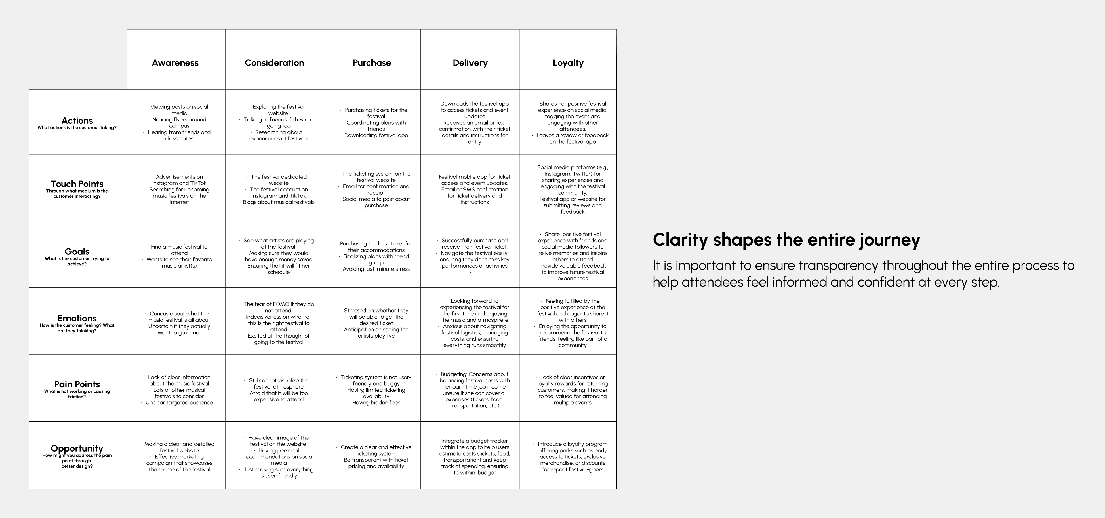
Mapping out attendee experience
Moving forward with the design, I decided to focus on Luna, as I believed that her persona would closely relate to the majority of attendees at this festival: a first-time festival-goer seeking an immersive and memorable experience.
VISUAL DIRECTION
Shaping the festival's aesthetic
To begin the design phase, I created a mood board and color palette that guided the visual direction for ROOTED, shaping an experience that feels grounded, expressive, and culturally rich.
Additionally, I ensured that all color combinations used met the WCAG accessibility standards.
Logo
Representing the brand at a glance
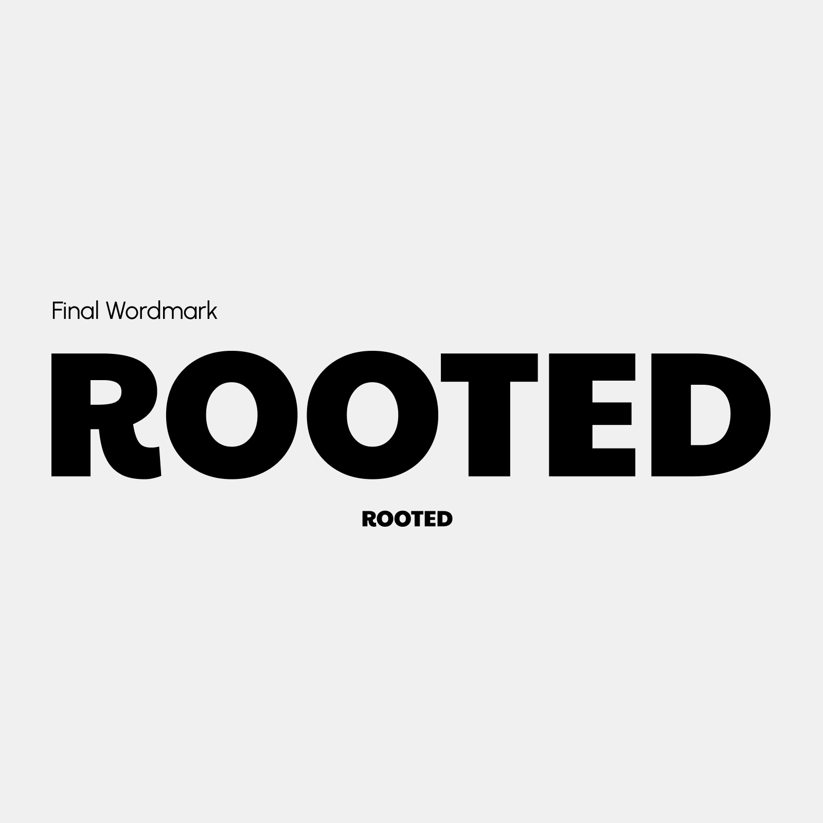
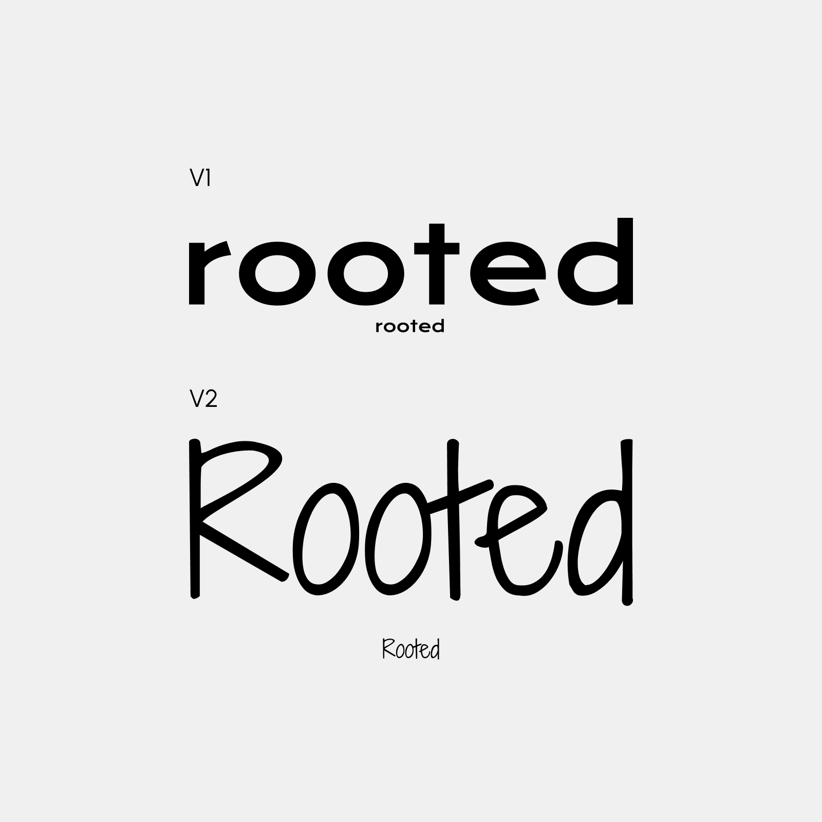
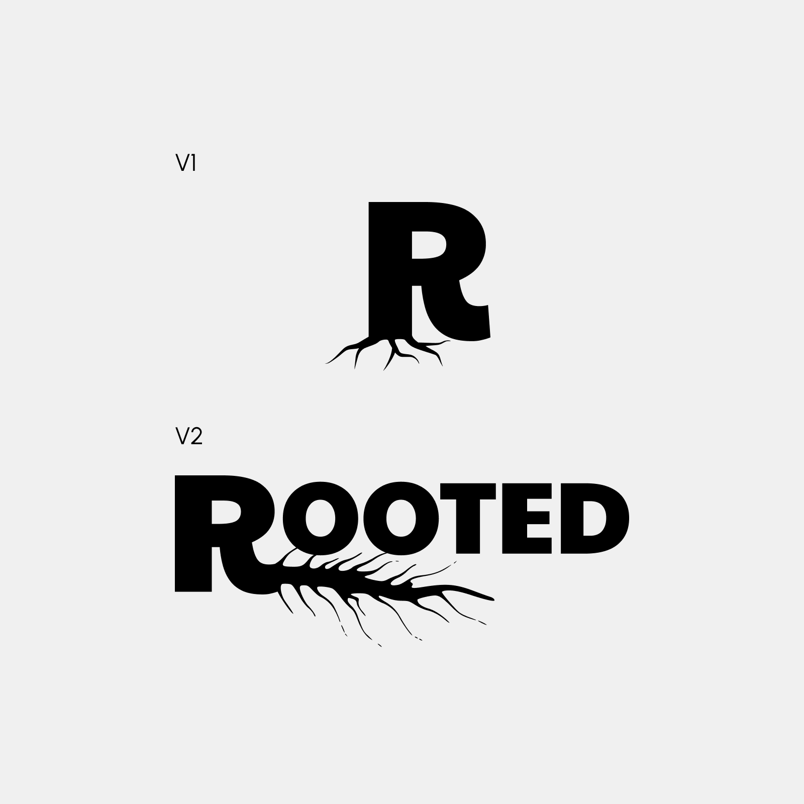
When designing the festival's wordmark, I aimed to evoke a sense of stability, belonging, and legacy to reflect how the festival honors the cultural roots of R&B and hip-hop while celebrating pride and unity within the community.
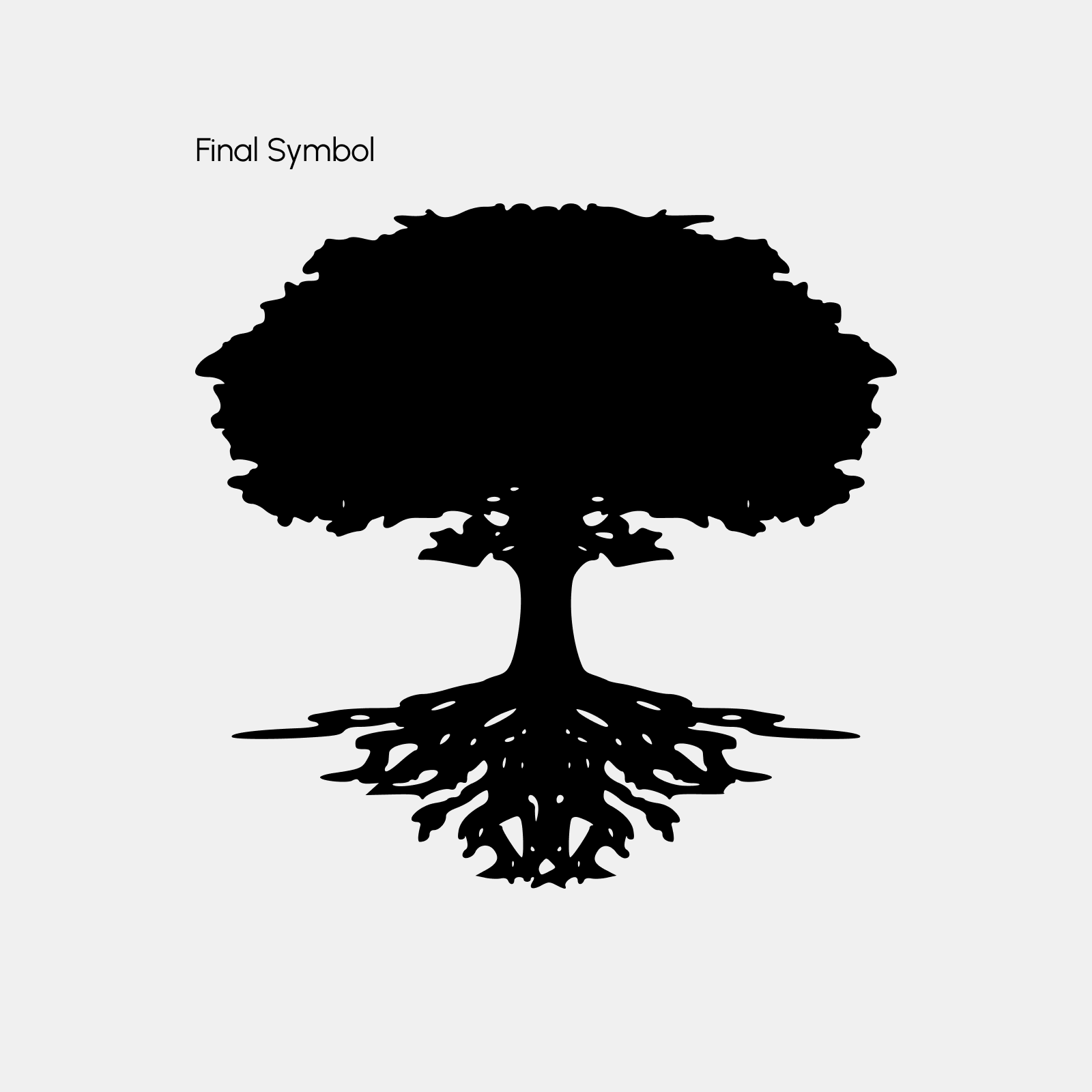
Additionally, I designed a festival symbol to pair with the wordmark. I chose a tree with roots to embody the themes of heritage, growth, and unity.
I selected Paytone One, a sans-serif font featuring a finial that creates a sense of continuity, symbolizing the enduring influence of R&B and hip-hop, connecting the past with the present. The use of all caps and bold weight further emphasizes the feeling of belonging.
The tree's deep roots symbolize the heritage and origins of R&B and hip-hop, while its growing branches represent the genres' evolution. The interconnected roots signify unity.
typography
Communicating tone through type
Next, I wanted to pair the wordmark font, Paytone One, with a complimentary font to use throughout the festival brand; I settled on using Bree Serif. Though they have distinct anatomical features, the fonts share a cohesive visual tone that allows them to complement each other well.
The flat terminals of Paytone One give it a clean and modern appearance. When paired with Bree Serif’s more bracketed terminals, the combination adds a sense of structure and stability, enhancing the overall balance between modern and formal elements.
Poster
Extending the brand through promotional material
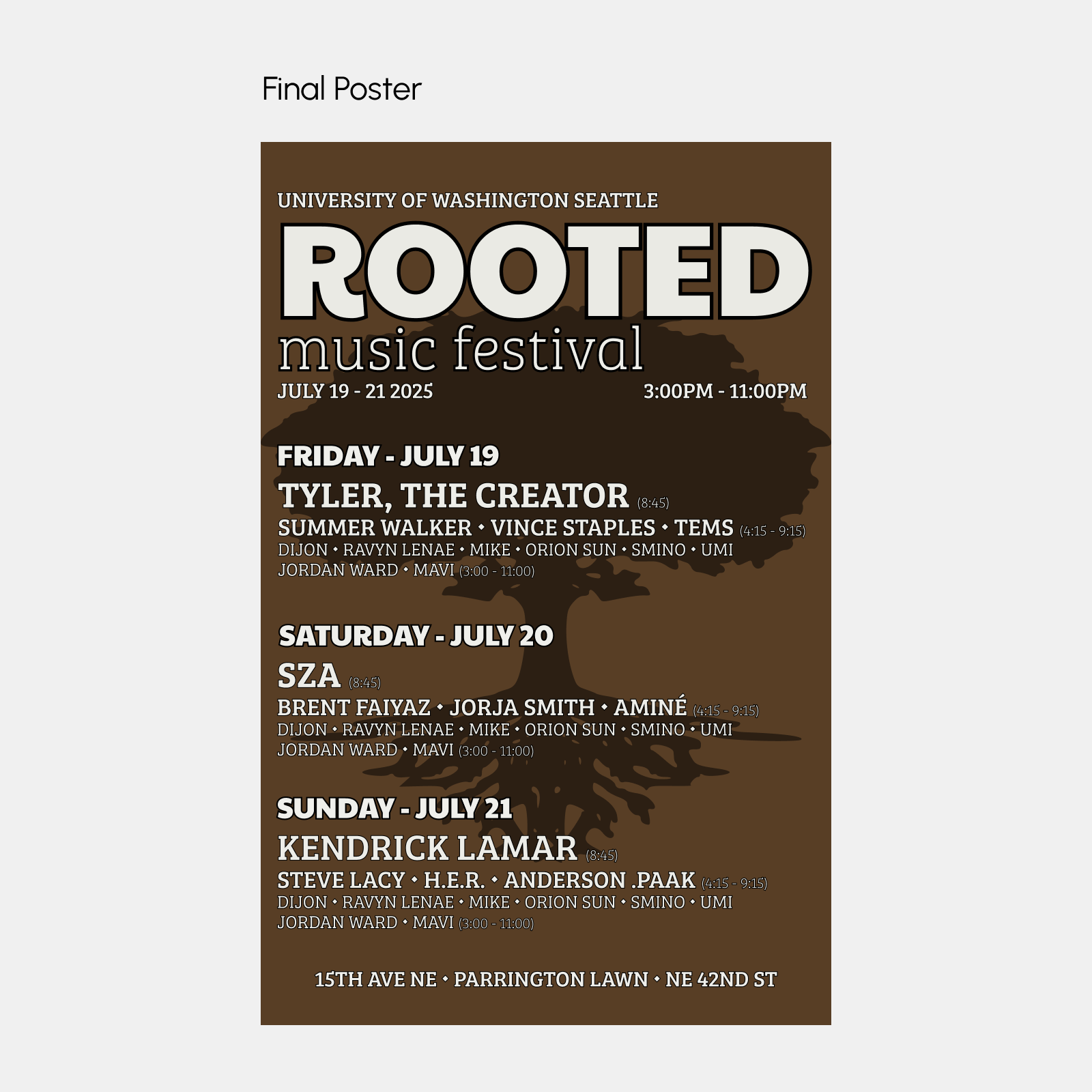
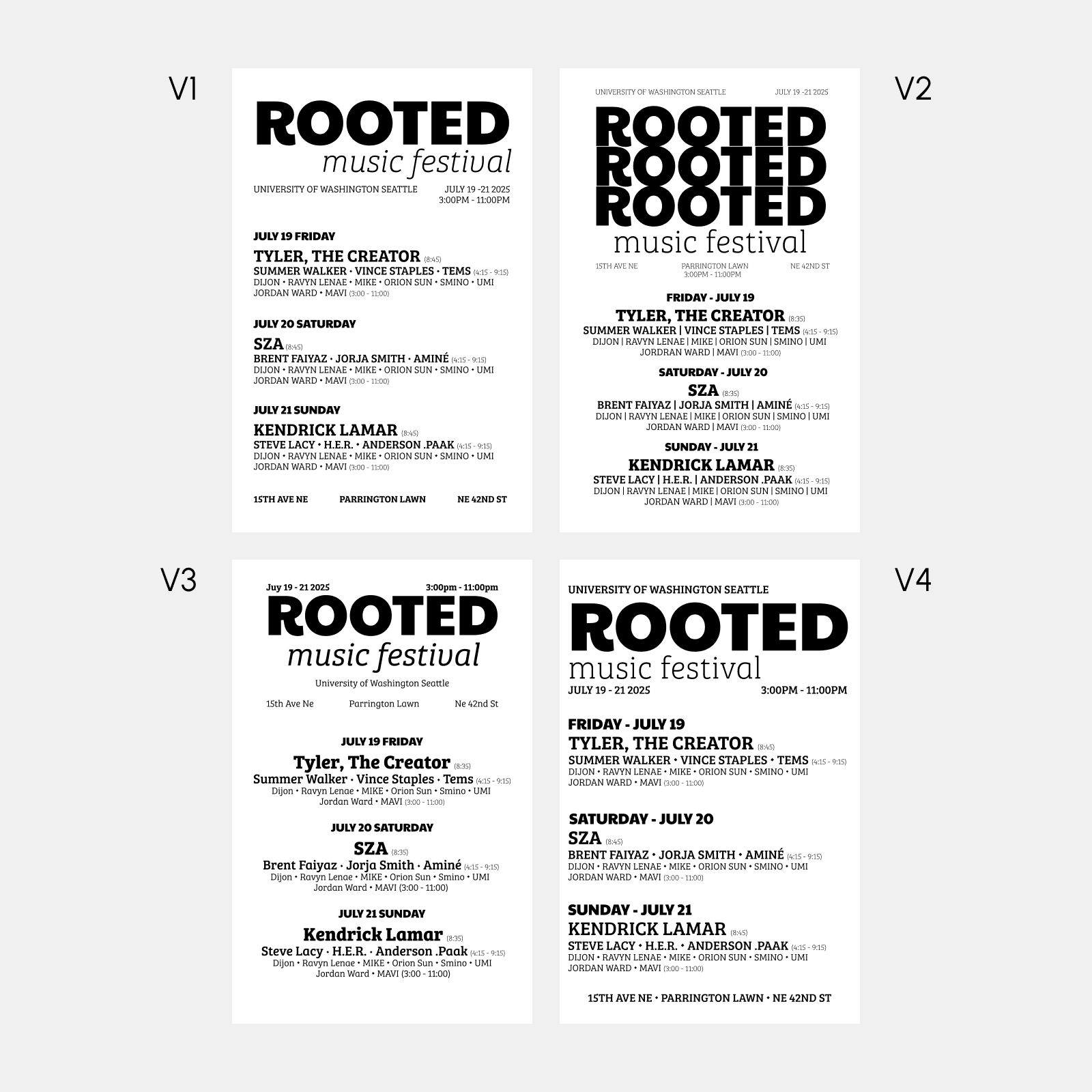
With the visual identity established, I was then able to move on and create a promotional poster for the festival, highlighting all the essential details.
Outlining key interactions for a seamless experience
As part of the next phase, I was tasked with creating an interactive festival application designed to help attendees navigate the event while fostering connection and community through integrated social features.
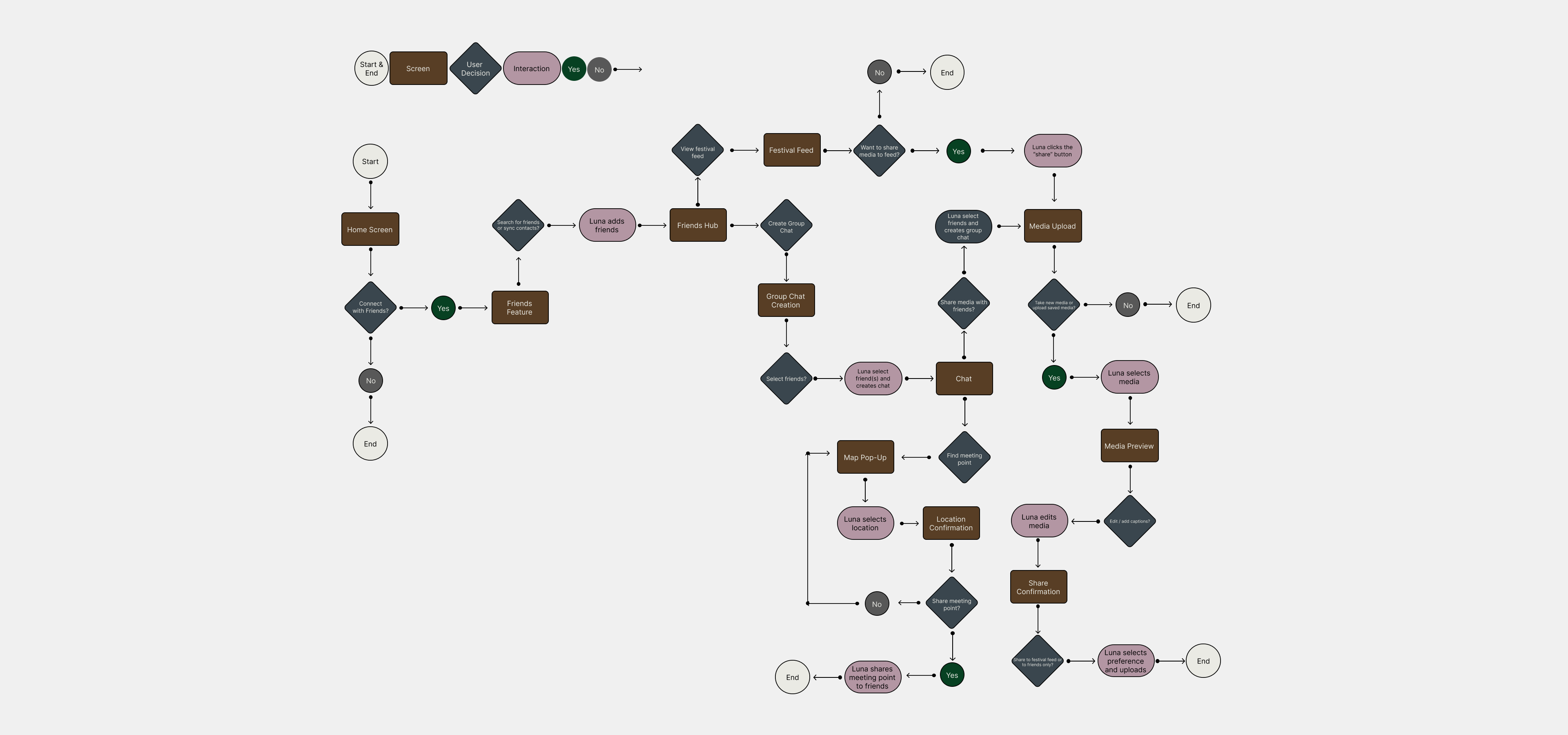
I created a user flow that highlights how social features such as a festival feed, messaging, and location sharing support Luna in connecting with friends and enhancing her overall experience.
Wireframes
Translating flow into visual structure
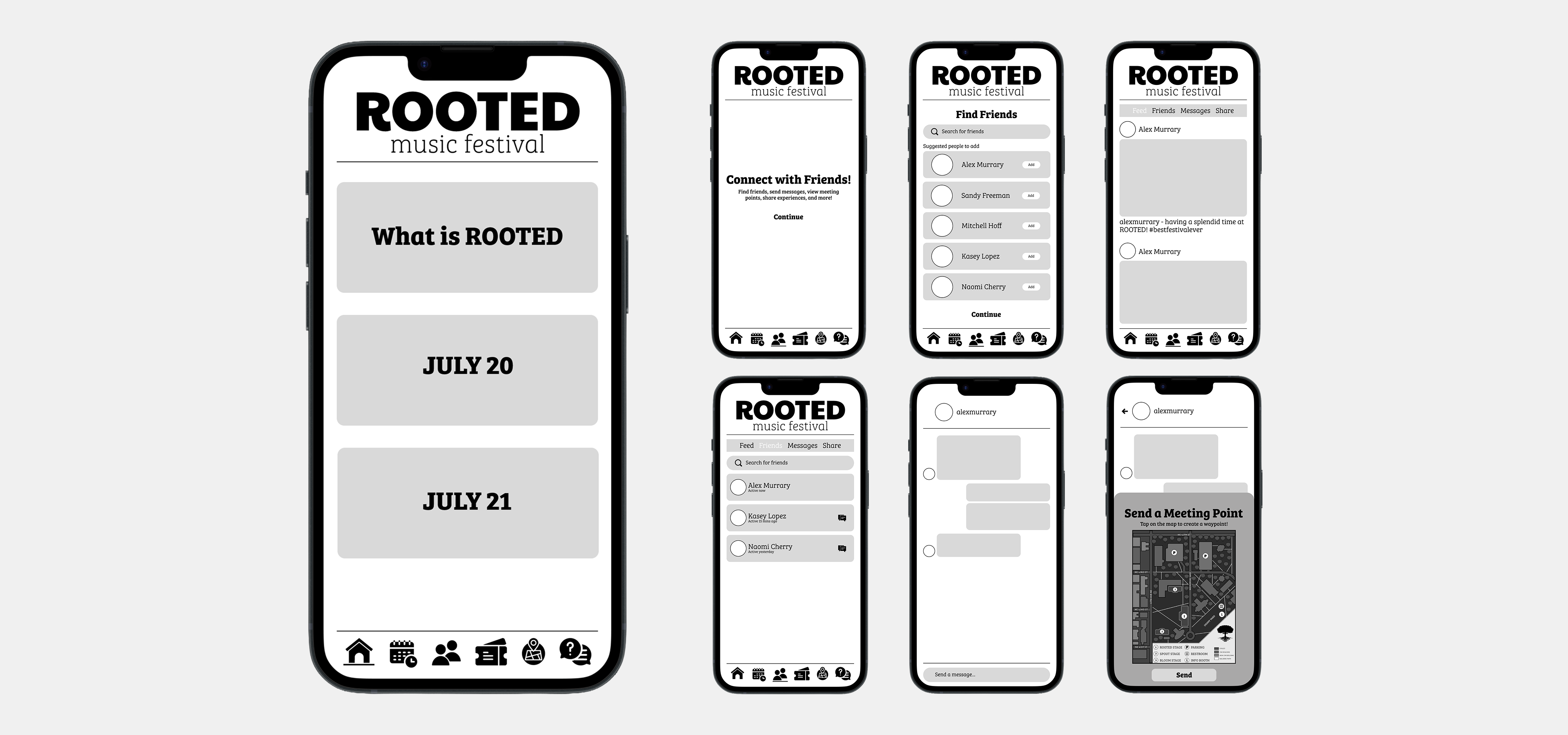
I then created wireframes for key screens that enable social connection.
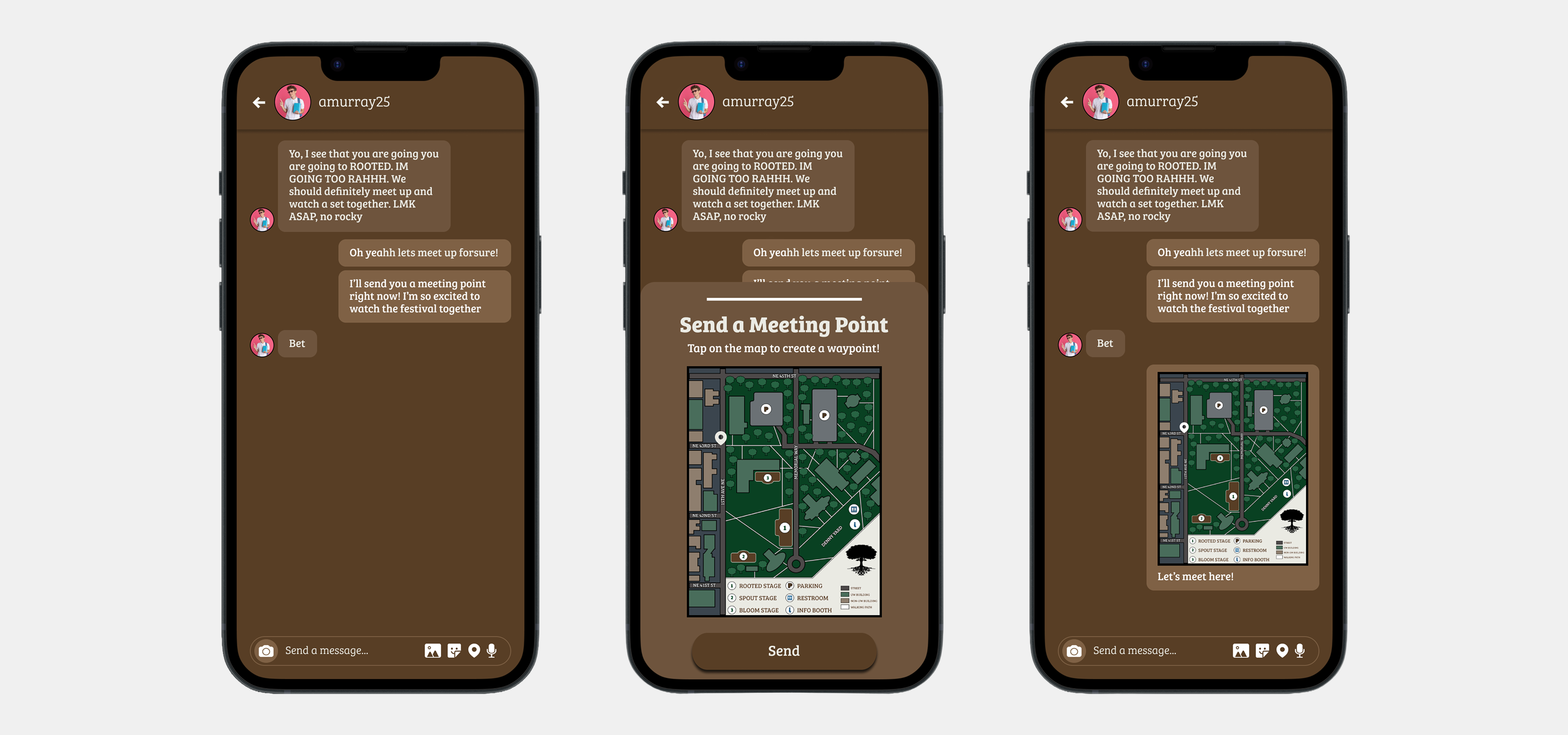
These include a festival feed for sharing experiences, a messaging portal for direct communication, and a feature to create and share meeting points within the messaging portal.
ui development
Building the visual interface
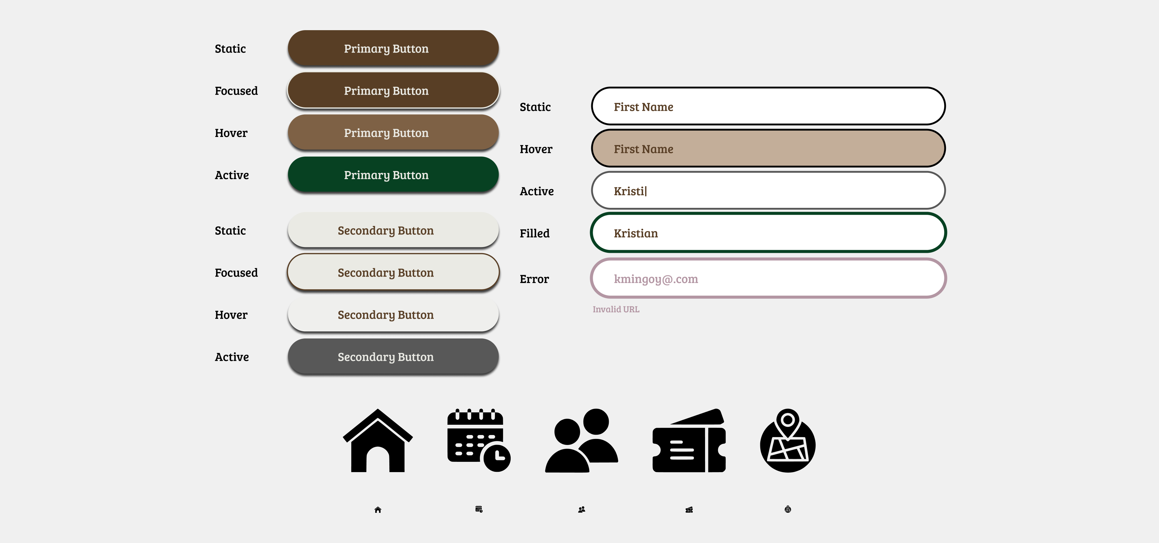
To finalize the application, I created a style tile to establish the app’s visual system; these elements were designed to ensure consistency across the interface and maintain alignment with the festival’s branding.
Final outcome
A distinctive music festival digital experience
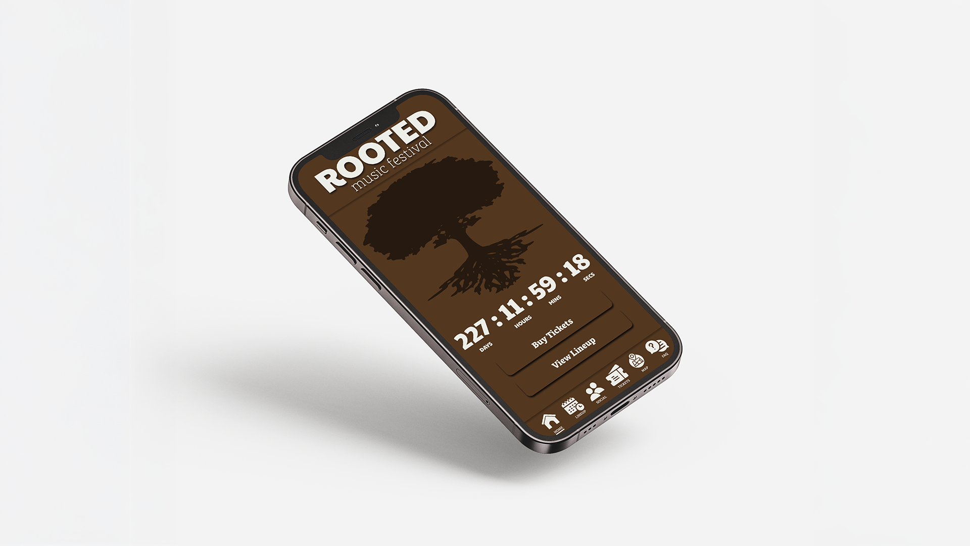
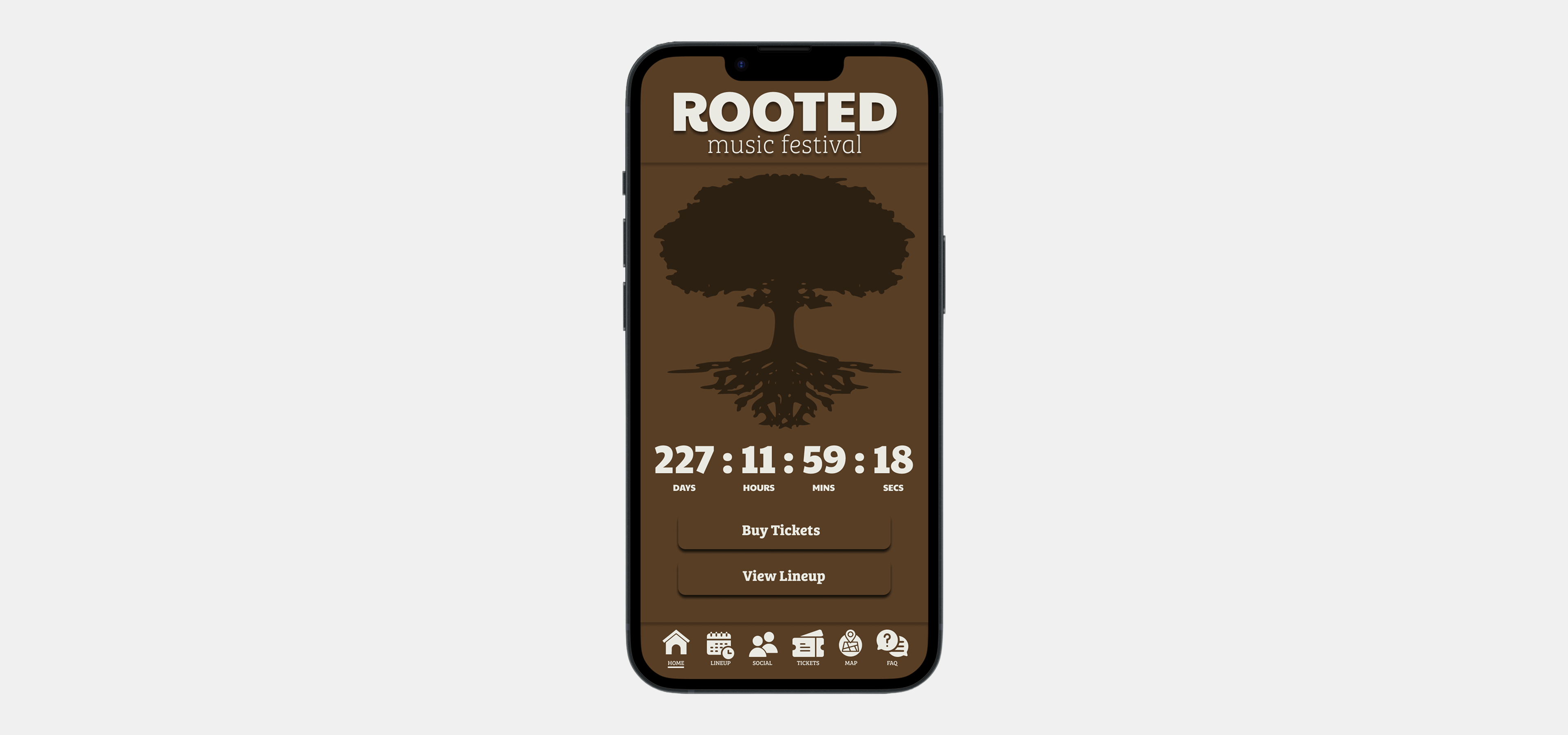
Home
Social Feature
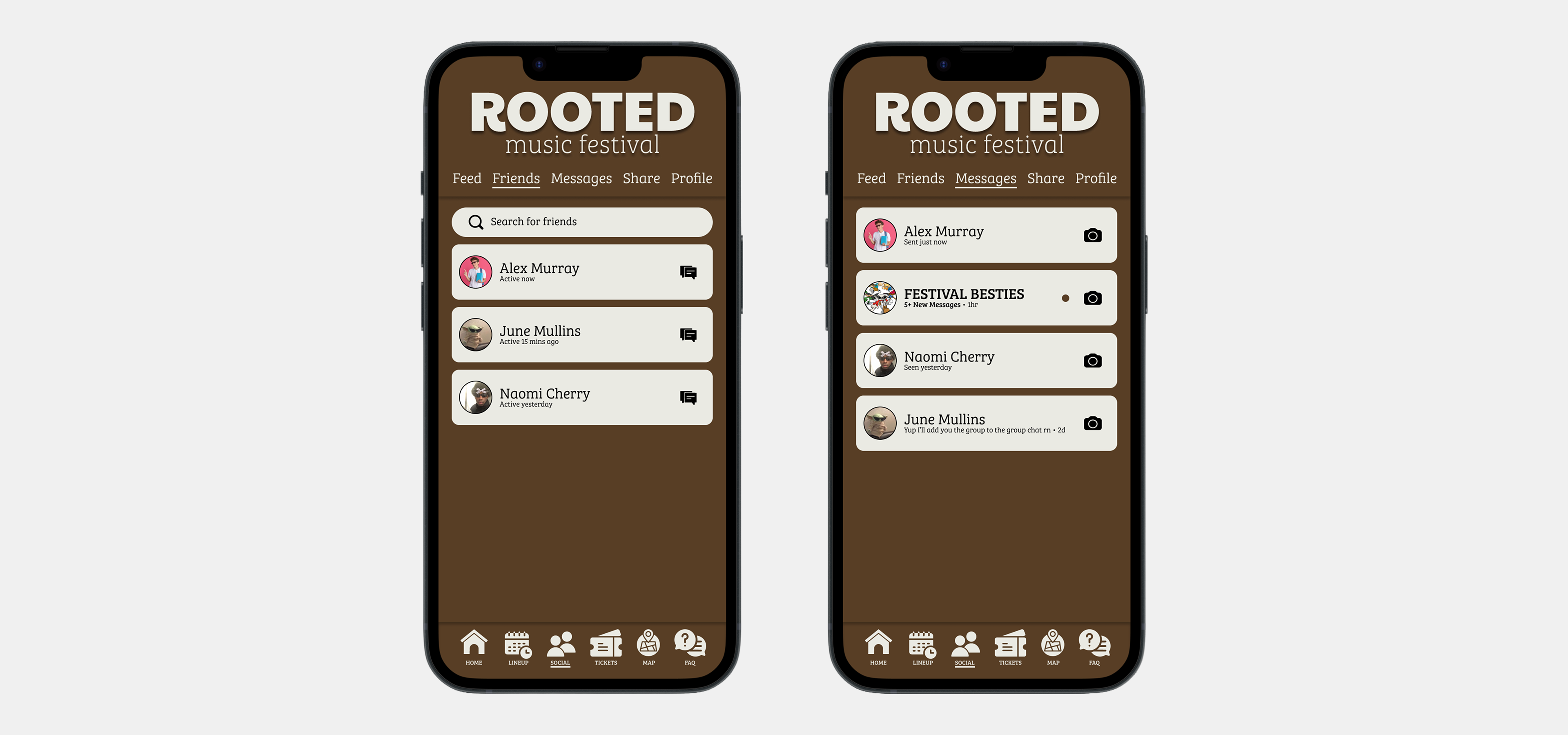
Friends and Messages
Messages Use-Case
reflection
Evaluating the design process and outcomes
By completing this quarter-long project, I gained valuable experience in building a cohesive brand identity from the ground up. The process deepened my understanding of visual design, user experience, and effective communication while reinforcing key lessons in research and iteration.
Cohesive Visual Identity Developing a unified visual system, from the wordmark to the festival application, emphasized the importance of consistency in creating a recognizable and trustworthy brand.
Iterative Process Balancing creativity with user feedback and research highlighted the significance of iteration in refining the experience to meet functional user needs effectively.
Time Management Working within deadlines underscored the importance of prioritization and maintaining efficient workflows to ensure timely project completion.
Thank you for exploring this case study. Please reach out if you have any questions or would like to connect.
.png)

.png)


.png)
.png)
